
Why Understanding Color Theory is Essential for Artists
Color theory is the backbone of compelling artwork. Whether you paint digitally, with watercolors, or oils, knowing how colors interact will:
- Set the mood (warm vs. cool tones)
- Create depth (light vs. dark values)
- Make your art visually harmonious
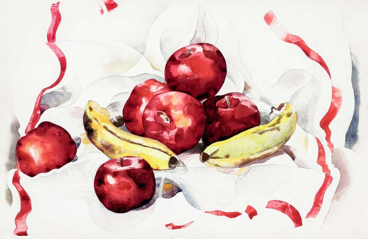
🎨 Fun Fact: Did you know Van Gogh used complementary colors (like blue and orange) to make his paintings vibrate with energy?
1. Color Theory Basics: Hue, Saturation, and Value
Every color has three key properties:
- Hue – The pure color (e.g., red, blue).
- Saturation – Its intensity (vivid vs. muted).
- Value – How light or dark it is.
Artist Tip: Struggling with flat artwork? Adjust the value contrast—it’s more important than hue!
2. 4 Proven Color Schemes for Stunning Art
Monochromatic Color Scheme
- Uses one hue in different shades (e.g., dark blue to light blue).
- Best for: Minimalist or dramatic pieces.
Analogous Color Scheme
- Colors next to each other on the color wheel (e.g., yellow, yellow-green, green).
- Best for: Calm, cohesive landscapes or portraits.
Complementary Color Scheme
- Opposite colors on the wheel (e.g., red/green, purple/yellow).
- Best for: High-contrast, dynamic artwork.
Triadic Color Scheme
- Three colors evenly spaced (e.g., red, blue, yellow).
- Best for: Balanced yet vibrant compositions.
🖌️ Try This: Open a color wheel tool (like Adobe Color) to experiment!
3. Fixing Common Color Mistakes
❌ Problem: Colors look muddy.
✅ Fix: Avoid mixing complementary colors too much—they neutralize each other.
❌ Problem: Shadows look flat.
✅ Fix: Shadows aren’t gray! Use blue, purple, or warm tones based on lighting.
❌ Problem: Art feels chaotic.
✅ Fix: Stick to one dominant color scheme (e.g., 60% main color, 30% secondary, 10% accent).
4. Pro Tips to Elevate Your Color Game
- Study nature – Notice how sunlight affects colors at different times of day.
- Limit your palette – 3-5 colors max for harmony.
- Test digitally first – Use apps like Procreate or Photoshop to preview palettes.
“Color is a power that directly influences the soul.” — Wassily Kandinsky
FAQs (Artist Questions Answered)
Q: How do I make colors pop without over-saturating?
A: Use complementary colors sparingly (e.g., a tiny red accent in a green landscape).
Q: Why do my digital paintings look dull?
A: Check your layer blending modes—try “Overlay” or “Color Dodge” for vibrancy.
Q: What’s the easiest color scheme for beginners?
A: Analogous—it’s hard to mess up!
Test your skills with our Color Theory Worksheet (PDF) – answers revealed when you’re ready!
🎨 Click to Reveal Worksheet Answers
**Section 1: Color Wheel Labels** 1. Primary Colors: Red, Yellow, Blue 2. Secondary Colors: Green, Orange, Purple 3. Tertiary Colors: Red-Orange, Yellow-Orange, Yellow-Green, Blue-Green, Blue-Purple, Red-Purple **Section 2: Color Harmonies** 4. Analogous Example: Blue, Blue-Green, Green 5. Complementary Example: Red + Green 6. Triadic Example: Red, Yellow, Blue **Section 3: Color Context** 7. Red appears brightest on a **black** background. 8. The two purple squares are **identical** (optical illusion).